Learn the Box Model with Tailwind CSS
Tailwind CSS is a practical way to learn the CSS box model because the utilities map directly to the underlying properties.
If you understand what padding, border, and margin do, Tailwind's spacing classes become much easier to reason about.
So what is the box model?
The box model is the rectangle around every HTML element. It has four parts:
- content: the actual text, image, or nested element
- padding: space between the content and the border
- border: the line around the element
- margin: space outside the border
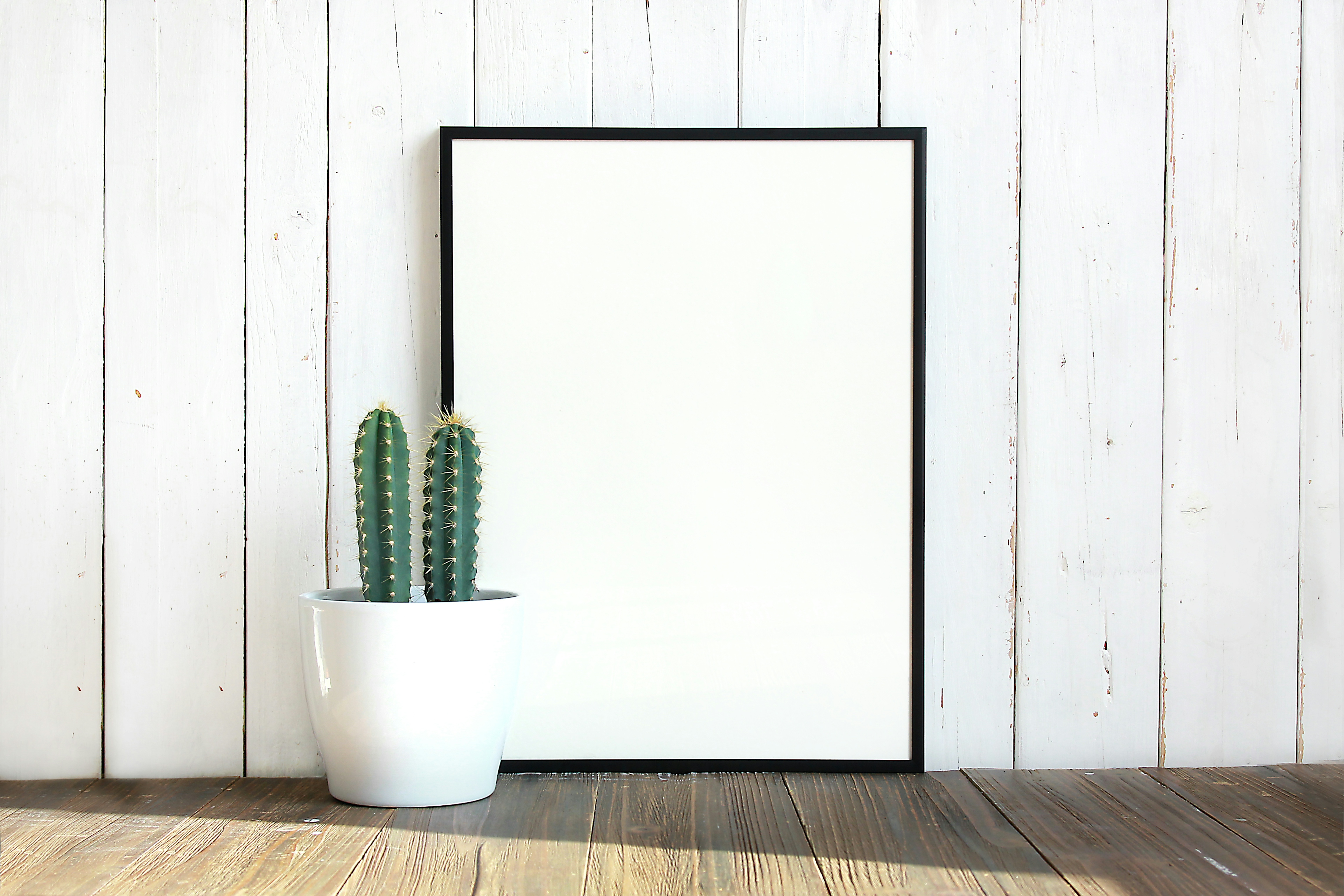
Here's a visual version of that idea.
A simple way to remember it is to think about a framed photograph:
- the photo itself is the content
- the space between the photo and the frame is padding
- the frame is the border
- the space around the framed photo is margin
Styling A Button
Let's start with a bare button.
<button class="bg-indigo-600 text-white">Submit</button>
Right now the content is there, but the element is still visually tight because there is no padding or border.
Adding padding gives the button breathing room and makes the click target feel more usable.
<button class="bg-indigo-600 px-4 py-2 text-white">Submit</button>
px-4 adds horizontal padding and py-2 adds vertical padding.
Next, let's add a border and a subtle shadow.
<button class="bg-indigo-600 px-4 py-2 text-white border border-indigo-700 shadow-sm">
  Submit
</button>
A border gives the button a defined edge, and a small shadow adds depth without making the styling feel dated.
In modern Tailwind projects, shadow, ring, and contrast are usually more useful than elaborate border tricks.
If you are trying to create a pressed or elevated state, prefer those utilities first.
Spacing Between Elements
Margin controls space outside an element. That makes it useful when an item needs separation from surrounding content.
If you place two buttons side by side, they will touch unless you add spacing.
You can do that with margin:
<div>
  <button class="...">Submit</button>
  <button class="... ml-2">Cancel</button>
</div>
In modern layouts, though, gap is often the better default when the buttons live inside a flex or grid container.
It keeps spacing at the container level instead of baking spacing into each child.
<div class="flex gap-2">
  <button class="...">Submit</button>
  <button class="...">Cancel</button>
</div>
Summary
- Content is the thing the element contains.
- Padding adds space inside the element and increases the apparent size of the surface.
- Border draws the edge of the element and helps define its shape.
- Margin adds space outside the element and separates it from other content.
- Gap is often the cleanest way to space siblings in flex and grid layouts.
If you can picture which part of the box model a Tailwind class affects, you can usually choose the right utility without guessing.