How to Fix Bottom Padding for iOS Mobile Browsers
Problem
Note: This article assumes an iOS device.
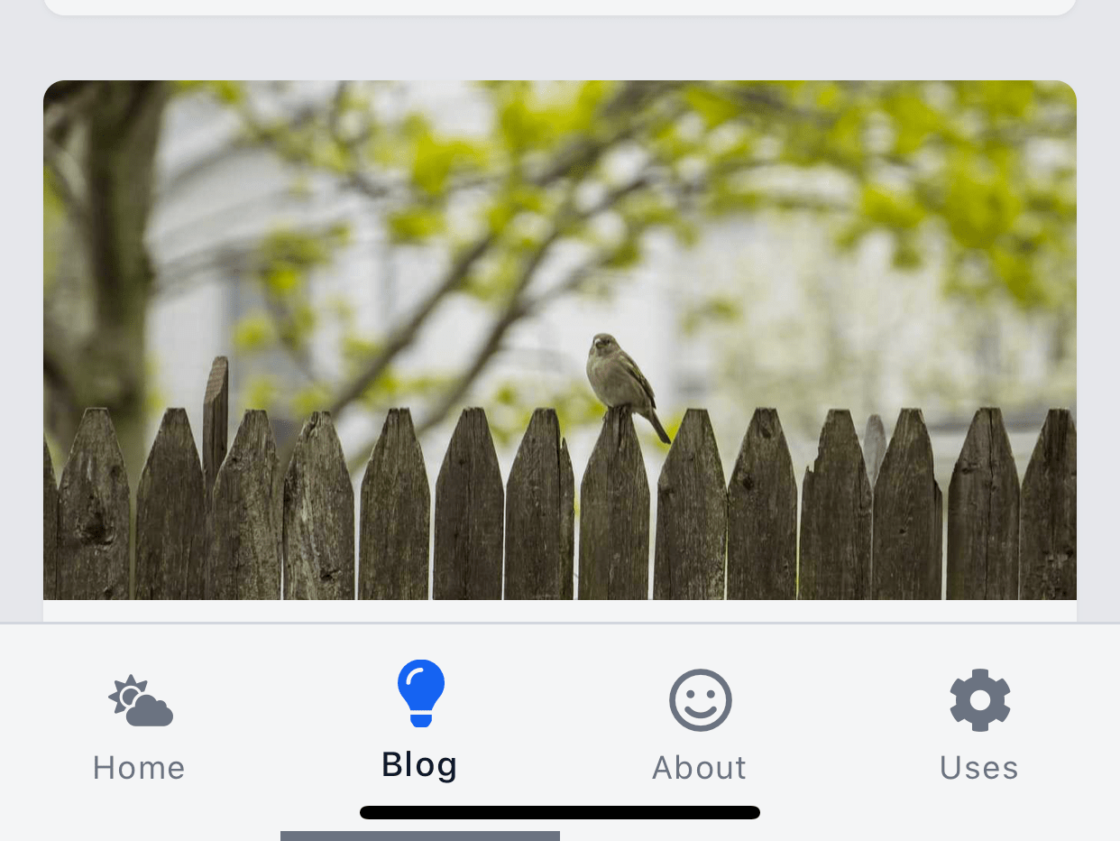
Let's say your design has a bottom navbar on mobile-sized screens.
Something like this:

This looks fine.
However, when we start scrolling down, the mobile browser's bottom menu goes away making our navbar tuck under the device's home-slider at the bottom.

We don't want that.
Luckily, the fix is simple.
Solution
We'll add the following utility class:
/* This adds extra bottom padding on mobile browsers */
.safe-bottom {
  padding-bottom: env(safe-area-inset-bottom);
}
Read more about env() on
MDN.
Next, we'll apply the class to the element that is overlapping at the bottom.
For you, that might be your site's <footer>.
<!-- Assume this is where your nav menu is -->
<footer class="safe-bottom">
  <!-- More stuff... -->
</footer>
In our HTML document's <head>, we need to set the following:
<!-- Put this in your document `head` -->
<meta
  name="viewport"
  content="width=device-width, initial-scale=1.0, viewport-fit=cover"
/>
Now, when we scroll up, the navbar looks unchanged.

But when we scroll down, we get a extra bottom padding to make way for the home slider.

That's all there is to it. 🎉
Hope this helps you build a better mobile experience for your users.


